Mirror

This is a speculative project. Mirror's website has been reworked to allow users to browse and purchase items - a new feature that was very much needed. This update allows for their debut into the world of E-Commerce. In addition, the company has been rebranded with a modern approach and an emphasis on clutter-free UI as that is a common mistake seen in E-Commerce website design.
overview
Mirror is a well-known Brick and Mortar clothing store chain boasting 400+ stores globally. Since their inception back in 1994, they have continuously provided affordable clothing for men, women, and children. Due to the particular outlook Mirror has on market trends, they rely more on catering to a broader audience. This allows Mirror to appear timeless, as they always have something in stock that would match nearly any current fad, aesthetic, or styles. While the appearance of the clothes might not need as much updating, some aspects of Mirror definitely need some modernizing. Mirror is in need of a website to aid in selling their apparel, and the fact that E-Commerce is now dominating the modern age makes this request a little more urgent. This was a case study performed on behalf of the DesignLab UI/UX Bootcamp.
Roles & Responsibilities
Problem Statement
Mirror's website and business model was outdated - the biggest issue being that there was no option to browse and purchase items online. This caused them to lose out on many transaction opportunities as well as prevents them from exposure to a large audience of primarily/exclusively online-shopping consumers.
Research objectives
Research Findings
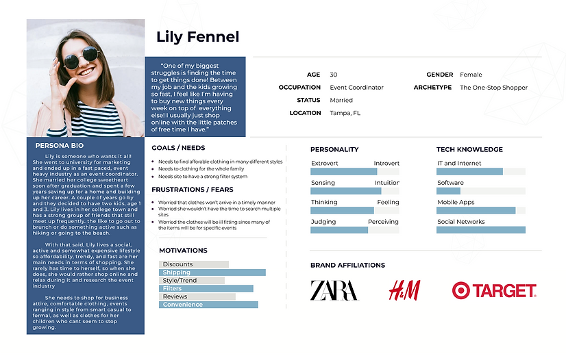
After deliberating on the market and user research, we now understand what the priorities are and who the target audience is. The persona, Lily, was created to encapsulate all of the information gathered so designing the website is more straight forward and clearly defined. The design reflects Lily and what users like her would like to experience in an E-Commerce website.
User Needs
-
Access to alternative payment processing, such as Apple Pay or PayPal
-
A clear link to a size guide to easily understand the sizing for an article of clothing
-
Ability to easily read reviews and understand how other users felt about the item they want to purchase
User Challenges
-
Improper or insufficient sizing information that leads to items that are too large or too small for the individual
-
Proper shipment tracking, so that if a delay occurs the user is well aware of it
-
Lack of user interaction from previous buyers, so user is unsure if item will fit his or her needs
competitive analysis
competitive analysis

Strengths
-
Clearly marked filters in brand color
-
Shows just the clothing when you hover over photo
Weaknesses
-
Features/text feel disproportionate
-
Page does not seem cohesive
Persona
Design Elements

Mood Board
Inspired by the harmonious colors of a capsule wardrobe. A capsule wardrobe is a wardrobe consisting of a limited selection of interchangeable clothing that compliment each other. It is consists of primarily neutrals items, a few different shades of blues from the jeans, and a few colorful items to add a pops of color.
It is also inspired by the aesthetic of a Summer by the beach in Greece.
Style Tile

High-Fidelity Wireframe


Usability Testing
Usability Testing
Usability Testing
Now that the high-fidelity wireframe is complete, the usability testing begins to ensure the website was designed well with the users needs in mind. The positive and negative feedback will help pinpoint the areas that need improvement. This is an essential step because the user will be reviewing it from the user standpoint rather than a designer standpoint. There will be five participants that are within the target audience.
Test objectives
Validate that a user can properly maneuver around the home page.
Validate that a user is able to complete the checkout process.
Validate that a user can navigate to the product page through one of the 7 possible routes.
Ensure that there are not confusions.
Validate that a user can add an article of clothing to their cart.
Prototype & Flow

The Flow
Home Page
v
Catalog Page(7 routes)
v
Product Page
v
Shopping bag
v
Check Out
v
Complete Purchase
rESULTS: Affinity Map


Unexpected Findings
-
Majority would prefer to shop on a catalog page that shows all types of clothing. Catalog pages such as ‘View All’, ‘Trending’, ‘New Arrivals’. They prefer to start off broader in their search.
-
People prefer when the websites aren’t static and corporate feeling. Fun phrases and interactions make it more enjoyable.
-
Majority saw the sales banner and mentioned it but did not click it first.
AfterThoughts
Though the prototype seemed to effectively direct users through the checkout process, and thus completing the task at hand, it did leave a little to be desired. A common pain point that the users encountered regarded the usefulness of a search bar, and how it would be a great incorporation to the site. This advice was applied to the prototype, and it definitely added to the site's ease of use. Nevertheless, there was still a significantly positive reaction to other aspects of the prototype. One of the main points almost each user stressed was the great branding and the clean layout of the product page.