Fiesta
Cancun

The website was reworked to reflect the fun and colorful essence of the restaurant’s atmosphere in a tastefully modern way. The owners were open to all branding ideas with the only request being that it has some Mexican influences in the design. Along with the branding and logo creation, an online order page has been implemented to allow for pick up orders (to be done directly on the site) and a way to be redirected to UberEATS and Door Dash’s site for delivery service.
overview
Established in 2021, Fiesta Cancun is a family-owned Mexican restaurant located in Altamonte Springs, Florida. The establishment has a colorful and immersive environment allowing you to experience authentic Mexican cuisine in all its glory. The restaurant is furnished with hand-made booths/tables/light fixtures from the owner’s relative back in Mexico. Their goal is to share their heritage and family recipes for all to enjoy.
Being that they are a small business, they do not have the time or resources to invest in their online presence. At the time of meeting, they were in the process of getting their restaurant on UberEats and Door Dash so a way to get to those from the website was a must. The owners also requested for a brand and logo creation as they did not have either.
Roles & Responsibilities
Problem Statement
The website is currently a cookie cutter template with only the menu, a brief introduction, and the location displayed. They also advertise on social media via Facebook and Instagram, but it is not highly advertised on the website itself. The website is not cohesive with the aesthetic of the restaurant itself. In addition it lacks certain standardized features such as the ability to order online and make reservations online.
Research objectives
Research Findings
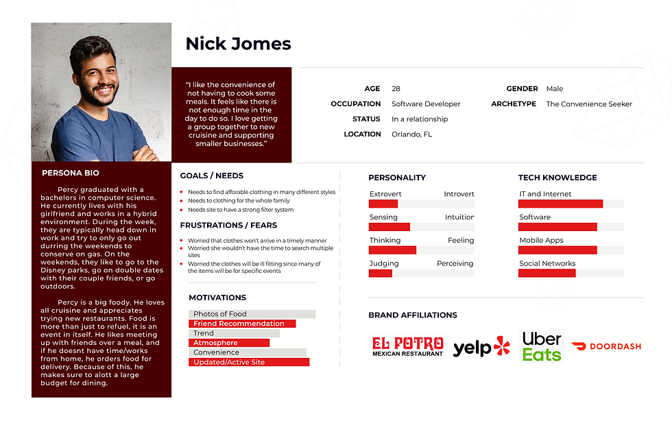
After deliberating on the market and user research, we now understand what the priorities are and who the target audience is. The persona, Nick, was created to encapsulate all of the information gathered, so we have a clearer vision of who we are designing the website for. The design reflects Nick, and what users like him would like to experience in a restaurant's website.
User Needs
-
Access to alternative payment processing, such as Apple Pay or PayPal
-
Quick access to external affiliated site for easy researching
-
Seamless online ordering process
User Challenges
-
Improper or insufficient restaurant information that causes users to feel as if there is a lack of reliability and transparency
-
Limited options in ordering method/food retrieval is out of date and makes users less inclined to order as there are easier options available elsewhere.
-
Lack of user interaction(reviews) from previous buyers, so user is unsure if the restaurant is reputable.
competitive analysis
competitive analysis

Strengths
-
Strong brand recognition
-
Quality photos of menu items making viewing menu easy
Weaknesses
-
Features/text feel disproportionate & excessively large in some areas
-
Getting back to main menu is a hassle (separate page)
Persona
Design Elements
Mood Board

The branding is inspired by the toucan, a beautifully colored bird that can be found in Central and South American countries such as Mexico and Brazil. They boast colorful beaks to help blend into the native plants found in the forest. Along with the tropical forests are Mexico's famous beaches. With an environment like this, it's no wonder Mexico's culture is vibrant and festive, thus it was important for the restaurants branding to reflect that.
The primary color is a bright blue to represent the ocean surrounding the country. Throughout the website there are pops of colors similar to the Toucans coloration along with hints of traditional Mexican patterns. Below is a style tile that reflects the mood board in a slightly subtler way with some modern influences as per the owners request.
Style Tile

High-fidelity wireframe
Home Page - Desktop & Mobile


Menu Page
The menu on the left is a regular view of the menu, and the menu on the right is what it looks like when a user is doing an online order for pick up.


Payment & Confirmation Page


Usability Testing
Now that the high-fidelity wireframe is complete, the usability testing begins to ensure the website was designed well with the users needs in mind. The positive and negative feedback will help pinpoint the areas that need improvement. This is an essential step because the user will be reviewing it from the user standpoint rather than a designer standpoint. There will be five participants that are within the target audience.
Test objectives
Validate that a user can understand the navigation and menu navigation
Validate that a user can complete the checkout process
Validate that a user can navigate to the order for pick up page through one of the three possible routes
Ensure that there are no confusions in the menu item sorting
Validate that a user can add a menu item to the cart and edit the item
Prototype & Flow

The Flow
1 2 3 4 5 6
Home Online Order Menu Cart Check Out Confirmation
rESULTS: Affinity Map

Unexpected Findings
-
There is a preference for a longer menu with many images over a concise menu.
-
People prefer when the websites aren’t static and corporate feeling. Participants were very receptive to the colors and interactions.
-
A navigation bar with icons, though uncommon in web design, was a hit and a highly complimented thing.
AfterThoughts
Over the course of this study, Fiesta Cancun was an incredible and eager client for modernizing their website. The newly proposed redesign went through a positive usability testing session; however, there were some minor concerns raised.
The task at hand was to complete the checkout process for ordering food for pickup. Majority of the pain points were quite helpful and lead to iterations to improve the site. There is one suggestion made by two of the five participants to remove the ‘colored triangles’ border from the menu page as it was too colorful and unappealing. This is a perfect example of how UI elements can be interpreted differently and that not every decision will be liked by all. Since this was not a universal complaint, and since the client has significant color in their restaurant and wants color on the website, it was decided that it should remain.
The inspiration for it was to resemble the festive banner used at many gatherings so it is a nice homage to the owners heritage. On the contrary, it was highly regarded that the Mexican tiled backgrounds on the site added much needed ‘pop’. Design critiques are always somewhat subjective; however, some of the other critiques will be considered in further revisions to the site.